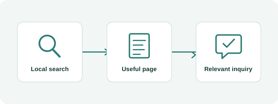
Write the brief around patient decisions
Start with the clinic's real operating model. A solo acupuncturist with a single office needs a different site from a multidisciplinary practice with several practitioners and locations. List the services, locations, languages and appointment types that exist today. Identify who approves each fact and who will maintain it after launch. The design brief should describe those relationships before it specifies a color palette.
Collect the questions your receptionist answers most often. A website can explain an arrival process, distinguish a new-patient appointment from a follow-up, or clarify how to ask about payment. This work reduces uncertainty for visitors. It also gives a designer concrete content to organize instead of filling every section with interchangeable wellness slogans.
Define the main action precisely. 'Request an appointment' means staff still need to confirm it. 'Book an appointment' should lead to a process that actually reserves a time. If the scheduler only supports existing patients, do not send every new visitor into it. Document the appropriate route for each group and use labels that describe what will happen.
Use a page inventory with a clear acceptance test
The inventory below is a starting structure, not a required page count. A small practice can combine closely related sections when the result stays clear. Split a page when a visitor has a different task or the information becomes difficult to navigate. For example, a detailed arrival guide may deserve a location page, while a short parking note can remain beside the address.
Require the website proposal to say who supplies copy, who verifies practitioner information, whether translation is included and how many revision rounds are available. 'Five pages included' is not a useful comparison when one quote includes interviews and writing while another expects the clinic to provide finished text.
| Page or section | Visitor's question | Clinic supplies | Acceptance test |
|---|---|---|---|
| Home | Is this a relevant practice? | Identity, location, service summary | A new visitor can find a suitable next step |
| Practitioner | Who will I see? | Approved biography, credentials, photo | Names and qualifications match the clinic's records |
| Service | What appointment does this describe? | Actual scope and appointment process | Content identifies what is and is not offered |
| First visit | How do I prepare and arrive? | Intake instructions and practical details | Reception can follow the instructions without correcting them |
| Location | Can I find the entrance? | Address, entrance photo, access details | Directions lead to the correct building and entrance |
| Contact or booking | What happens after I submit? | Contact route, staff process, scheduler link | A test request reaches the correct team |
Show the practice without inventing authority
Use current practitioner names, accurate professional titles and qualifications the practice can substantiate. Link to an appropriate verification resource where useful. Do not display a stock-model headshot as the clinician or imply that a web agency reviewed clinical claims. Identify who approved clinical material and give them a way to correct it when services change.
Photograph the exterior, actual entrance, reception area and rooms you are comfortable showing publicly. Check that images do not expose patient identities, paperwork or screens. A simple entrance photograph can answer a more useful question than an elaborate decorative image. Give informative images descriptive text alternatives; decorative images can be treated as decoration rather than forced to carry search keywords.
Keep testimonials and clinical explanations distinct. Do not turn an individual account into a promise about another person's outcome. If you publish a clinical explanation, the responsible practitioner should approve both the wording and sources. The designer's job is to make that reviewed information readable and maintainable.
Test the appointment journey on a real phone
Open the home page on a phone and complete the intended journey without using your knowledge of the clinic. Choose an appointment, identify its location and practitioner, and reach the confirmation or request acknowledgement. Do this for both a new patient and a returning patient if the routes differ. Record confusing labels, hidden buttons, unreadable text and unexpected jumps into another language.
Test the failure paths too. What happens when no appointment is available? Does an incomplete form explain the problem next to the relevant field? Can a visitor navigate with a keyboard? Are form controls labeled, and is there a clear success message? W3C's forms tutorial provides implementation guidance for labels, instructions and feedback. Use it to make concrete acceptance criteria rather than relying on a generic 'accessible design' line in a proposal.
For a hypothetical clinic using an external scheduler, the website might pass a visitor to a vendor-controlled page. Test that page as part of the journey even if it is outside the design contract. Clarify which supplier fixes a broken appointment type, which team updates availability and what the clinic does when the service is unavailable. A prominent booking button cannot repair those gaps by itself.
Separate public inquiries from clinical intake
Agree on what information each form actually needs. A general website inquiry often needs only a way to respond and a nonclinical question. Detailed intake belongs in a workflow the practice has selected and reviewed for its requirements. Do not add a large free-text medical-history field simply because the form builder makes it easy.
Ask the clinic and its technology providers where submissions go, who can access them and which tracking tools run on the relevant screens. These are questions to resolve before launch, not conclusions a designer can infer from a lock icon or a vendor's marketing badge. Request specialist privacy or legal review when the proposed data handling requires it; a website template does not establish compliance.
Keep measurement focused on business events. A marketing report can track that an inquiry was received without including the contents of a patient's message. Do not put symptoms, names or appointment details into analytics event names, URLs or advertising audiences. Make a synthetic test submission and check that the intended staff member receives it, then remove the test data through the clinic's normal process.
Keep English and Chinese journeys complete
If the practice serves English- and Chinese-speaking visitors, decide who maintains both versions. Translate the practical journey, including form labels, errors, confirmation messages and directions. A Chinese introduction followed by an unexplained English-only booking form creates a gap at the exact moment the visitor is trying to act.
Use visible language navigation and pair equivalent pages. State accurately which staff can assist in each language and how a visitor should request that help. Avoid promising that every appointment is available in both languages unless the schedule supports it. The more detailed technical decisions, such as separate language URLs and alternate annotations, belong in the bilingual implementation brief.
Protect useful URLs when replacing an existing website
Before a redesign, inventory existing URLs and identify pages that receive search visits or have useful external links. Map each retained topic to its new destination. Keep a URL when the page's purpose has not changed and there is no compelling reason to move it. If a URL must change, specify a relevant permanent redirect rather than sending every old page to the home page.
Have the implementer verify crawlable page content, titles, canonical URLs, the production robots settings and the sitemap. Test important old links after launch. A staging site can look complete while the production site still carries an indexing block or sends appointment traffic to a test scheduler. Include these checks in the written handover.
Measure page experience separately from content or metadata checks. Google's page-experience guidance covers multiple signals; a visual review does not establish real-user performance. Request the testing method and the pages tested, especially on mobile. Preserve readable typography and useful content while fixing heavy assets or scripts.
Agree on ownership and a useful handover
The clinic should know who controls the domain, hosting, content editor, booking account and Search Console property. The handover should identify recurring subscriptions, backup arrangements, content-update responsibilities and the process for leaving the provider. Verify access while everyone is still available, not months later when a staff member needs to change an address.
Approve the site against the brief: verified facts, working forms, complete language journeys, mobile readability, useful redirects and a named person responsible for updates. Keep a short list of unresolved issues with owners. Wintra can turn this inventory into a website scope and help implement the English-Chinese structure; send the existing site and the actual booking workflow so the proposal can address your practice's needs.